
Master Pain and Gain Marketing for your Small Business
January 18, 2024
Picking Fonts in 10 minutes: A Quick Guide for Small Business Owners!
January 25, 2024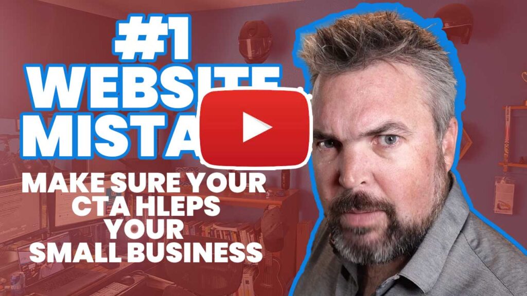
PDF Download: http://tinyurl.com/4edcx4r9
Is your website not working for your business? Are you constantly complaining about your website, not providing your business with any leads? Is your website as lonely as someone who goes to a batting cages? Just to play catch, there is one thing that causes most small business websites to fail, and I'm going to help you conquer that today. It's called The Call to Action.
Hi there. I'm Garik Goodell with G Squared Studio, and I help small businesses grow through digital marketing by simplifying the process and helping them focus on momentum over perfection. Today we're going to talk about CTA or call to action. This is truly the biggest, most important piece of your website. I always say every piece of marketing ever created should have a call to action, otherwise it is useless. So if you have a website with no call to action, I can help you today and if you have a website with a call to action, but it is actually not really working, not creating leads or helping your business grow, pay attention to the rest of this video because I'm going to help you conquer that as well as give you a little cheat sheet to make sure in the future the CTAs on your website help your business grow.
We're going to go over three things today. We're going to go over what not to do, how to figure out what the right call to action for your business website is, and then how to properly put a call to action on your website to get the highest potential click through rate or conversion, depending on which term you want to use. So why do most small business websites call to actions not actually help their business grow? It's because of a couple things, but one thing is most important. The number one reason most call to actions don't work is they aren't providing high value with low risk. How many times have you been on a website and you've been there for like three seconds, maybe less, and all of a sudden a popup comes up and then another popup and another popup, another popup, another popup, another popup, another popup, another popup, another pop.
That is not a positive experience. You're more likely to get someone to leave than you are to get someone to sign up for your newsletter. It is a high risk, low reward. Ooh, I can give you my email information and I'm going to get spammed by you. That's not a great call to action, so sorry if you got that on your site. Currently, newsletters aren't bad. I understand you could be providing great value with a newsletter, but it's not the first call to action you want people to experience, oh, set up for my newsletter. It's just, it's not going to work. It's very spammy. Don't do it. That means a big no-no is to just ask for someone's information without giving them any value first. That is an absolute don't no-go. The next main thing that small businesses are doing wrong with a call to action on their website is they're making them hard to find.
They're putting them at the bottom of a page, which seems kind of like a great idea. Oh, they've gotten all the way down here. They're probably sold. It's time to ask for the sell. That's not the best approach, and I will show you how to actually properly execute this later in the video. The other thing small businesses are doing wrong on their website with a call to action is not making it easy. That can be that they have that call to action button only found at the bottom of the page, which is unlikely for a majority of people to actually see it or potentially have it hidden in a body of text or potentially not having it that visible via it being the same color as the rest of the site, or they are not making it easy. By having a long contact form, too many questions, too many requirements, too many hoops to jump through those elements can really reduce the chance that someone's going to complete that process and then step into whatever your call to action is.
So those are the don'ts, absolutely. Do not do a call to action that isn't providing value and absolutely do not make your call to action hard to find or hard to take. That next step with now you're thinking, how do I make sure that the call to action I choose is the best one for my business? Well, the first thing to think about and keep in mind is that high reward, high value, low risk mentality. So who is your target market and how can you give them high piece of value that's in alignment with your business that then is very low risk for them? For example, subscribing to my YouTube channel, very low risk, very high reward. See what I did there? A really common high functioning call to action that works great for a lot of service industries is book a free consultation. This works great, especially if someone believes that you are great at what you do.
We'll talk a little bit later in the video on how to make sure people have that experience. As long as they believe you are great at what you do and the consultation is free, then it's a perfect opportunity for them to experience your business for free and get value from you. The other piece to keep in mind when you're thinking about this ideal call to action is your sales path. That is the path that from someone goes from being unhappy and potentially in a pain to having your service or product and then having that gain and then no longer being happy. Rarely can a call to action bridge that entire gap, but it can start someone down that path again. That's why a consultation is a great setup. So I have on my website a free 10 minute call. In that 10 minute call, I give high value. I make sure I learn a lot about their business, give them a couple tips and ideas that will be great for them, for their business and for their website, and it's very low risk. It's 10 minutes and it's free. So now you're seeing why it pop up. Get out of here. Did that one, did
That seriously say, sign up on my email list. That is a serious
Spam alert. Anyways, now you're seeing why a newsletter popup right away is not a great call to action and is going to get very low conversion. It is very high risk, very low reward. Again, I'm not saying that a signup for my newsletter is a terrible thing to do for all businesses. It actually can be a great thing to do. It is typically though best done in a follow-up experience. They already have an experience with you. They've either received some free value or they have made a purchase with you. They have a positive experience with you. Then they join your newsletter. Then they get reminders you exist. So when they need another service that's in your industry or they need another product that's in your realm of products you sell, they'll be reminded you exist and then they'll repurchase. That's the best way to use your newsletter and we can dive into that in a whole nother video.
Okay, so now you know how to find out the best call to action for your business, something that takes someone down the sales path. It's high value and low risk. Once you have this call to action sorted out and chosen for your small business website, let's make sure you implement the seven things you must do to properly implement a call to action on your small business website. It's a working title. I know that's extremely too long, so here we go. Let's dive into the seven things. Number one, your call to action must have clear and concise messaging. It is way too much. If there are multiple paragraphs talking about your call to action, this should be just a few lines. Get directly to the pain and gain that your call to action will be providing for them. Visitors should quickly understand what action is you want them to take.
You don't need a paragraph next to your call to action button, just a quick statement, letting them know what value they're going to receive and what having that does for them. Number two, use action oriented language. Don't have your call to action button be like, please click. Maybe that would be a terrible call to action free download. Sign up now. Join my newsletter now. Oh man, that came back up. Buy now. Get started. Free consultation. Free is a great word. Now is a great word. Things like that. Quick action oriented statements on that button. Number three, make sure it's visible. There's a few ways that you can go wrong here. We talked about this earlier in the video by hiding it someplace in the text, so make sure it's put in a predominant location. Number one, predominant location. It should be is above the fold.
What is above the fold? You might be asking, well, it's an old newspaper term that talked about that first section of the newspaper you would see that was above where it was folded. Now it's talked about in a website term and it means that first section you see on your screen when you land on a website without scrolling, so you want to make sure you always have a call to action there. Someone might've already heard about your business, they might already be sold. They want to go to your website and buy right now. You don't want to slow down that process or put any barriers in between that. The other thing to do to make sure it's highly visible is use a color for your buttons specifically that are our contrasting color, something that draws the eye, something that's different than the rest of the website.
Quite often best practices are to have a call to action button color and there is nothing else on the website that is that color and it is used consistently for the calls to action throughout the website. The last thing about making sure it stays visible is double checking. Once you put your call to action up, making sure that it shows up in a good predominant location on mobile. Sometimes with responsive websites these days, your call to action might be super great on the desktop and totally hidden on the mobile or vice versa, so make sure it is highly visible and at the top in both formats. The fourth thing is trust element. Having testimonials on your homepage or near your call to action is a great idea, so this is what we were talking about earlier in the video. If someone is thinking about signing up for your free consultation but they don't know you yet, seeing some positive testimonials might help them get that confidence to then take that next step with you and your business.
Having the testimonials and then having the call to action just below that is a really, really great place to put another call to action on your homepage. Number five is having limited choices. You do not want to have seven different call to action options leading to seven different things on your website. It's going to be overwhelming. People aren't going to take that next step forward. Make sure you have one main call to action and you can have a secondary call to action if you feel it's necessary, such as learn more or if you are giving a free download. You can also have the option for a free consultation. It depends. Some people might want to take a slower approach instead of jumping right into a consultation and potentially receive from value, some value from you first. Number six, minimum form fields. We talked about this earlier.
Make sure if there is a form someone needs to fill out to receive that consultation or to get that download or whatever it is that you're going to provide in your call to action. Make sure there isn't too much work they have to do. If you do want to have a little bit of a barrier and not receive a thousand a day because it's some amazing thing you're giving away, make sure there's appropriate things in there. Make sure it's a long enough form, but if it is something super simple like my 10 minute phone call, anyone can sign up for it currently in early 2024. We'll see if that changes as my business grows, but currently anyone can sign up for it. The barrier is just as easy as clicking the button, picking a time on my calendar and putting in a little bit of information in.
Number seven, truly the most important is make sure you're providing value with your call to action. If you're not providing value, why would anyone click it? Make sure it's high value and low risk. So I know I ran through those pretty quick and because of that, I actually created A PDF that's down in the description for you to download. Please download this PDF and utilize it so when you are crafting your call to action and actually putting it on your website, you can make sure you do all seven things. All of them are tremendously important. The other thing to think about through this process is it can always be changed. It's the beautiful thing about working on websites is they're extremely malleable, so you don't have to be perfect. Get something out there, get some momentum, learn from it. If you use a red button and no one clicks it and then you try blue and then blue starts to work, boy, you just learn blue buttons.
Work better for your target market and then utilize that information. Try different words, try different things. If you're getting great conversion right off the bat, leave it alone. If you're just getting a little bit and you think you could do better, change it up. Mix it up. See what else it can do. I'm grateful that you're here to watch this video. I appreciate it very much. I hope you got value. If you know anyone else that might get value from this video, please feel free to share it with them. Please subscribe. I'm trying to get to one K by May. That sounds catchier every time I say it, and I hope you have a great day and great success. One last thing. Click that video either over here or over here. I forget what side it's going to be on, but it's about target market. It's a great piece to know before you start diving into this call to action, step one to a successful YouTube video. Do not disturb. Hit it on your phone. Distractions don't help. Hydration does.

